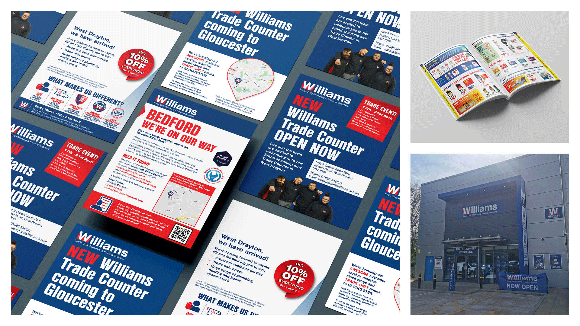
The client

Williams & Co are an award-winning plumbing and heating company for trade users.  One of the fastest growing independent merchants in the UK, they have more than 50 branches and fulfilment centres across the country, plus a comprehensive e-commerce site.

The Task

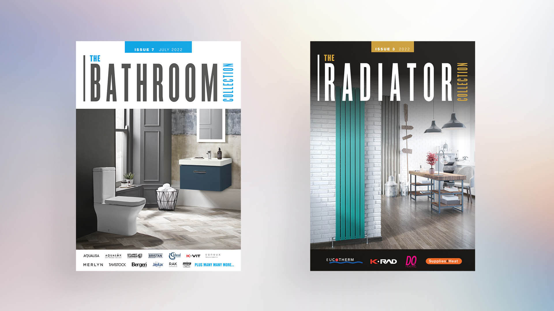
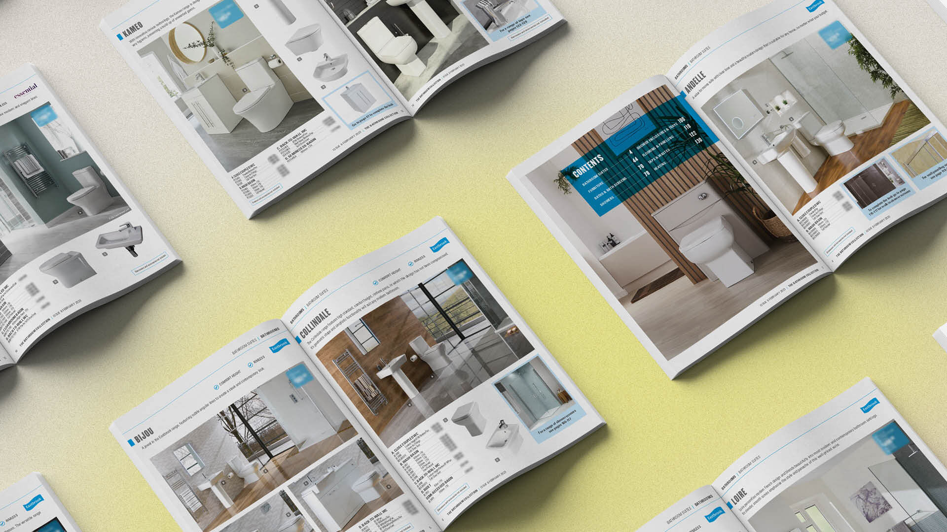
To bring consistency and clarity to Williams’ brand assets, and in doing so deliver a stronger, more professional and confident brand image in keeping with their ambition and ethos. Our involvement over several years has encompassed branding, campaigns, digital and printed assets.

What we delivered:

Updated logo
Williams logo already featured a strong ‘W’ monogram but the focus fell on the words ‘trade only’ instead of their name. We felt this was a lost opportunity for brand recognition, recall and association, so we brought it proudly and confidently to the forefront, while retaining the strap line. The result is a clear hierarchy of information and strong identity.

Colour palette
The core palette was blue and red, but the colour mix of the blue gave it a dark purple tinge, especially when produced in print. This didn’t look fresh, modern or purposeful. So, we set about finding a ‘bluer blue’, beginning with RAL colour.
This is the colour matching system of paints, coatings and plastics. While it offers less choice, by using it we could ensure that external signage would match their new print and digital assets.

We also extended the colour palette to add some complimentary blues, which enabled greater creative freedom while delivering a more sophisticated brand look.

Catologue design
Williams’ customers rely on their flagship Pricebusters catalogue, keeping a copy in their vans. However, it was reported that some of the table content was difficult to read due to the small size. A simple solution, which removed the need for a larger sized branch-based reference copy, was to re-visit the print spec.

By increasing the page size slightly, we were sensitive to Williams’ budget and were still able to make small changes that made a big difference. So much so, the branch copies were no longer needed.

To aid navigation and recognition we also introduced a wider range of icons and brought uniformity to the cover design. With everything templated, we’re able to give Williams’ a very agile service, able to cope with last minute changes and tight turnarounds.

Standardised marketing collateral
With an ambitious programme for opening new branches, standardising sets of printed and digital materials has made roll-out quicker, simpler, more cost-effective and maintained consistency. We even designed an interior suite of point-of-sale signage for their new branches.

“The team are continuously striving to improve their service to us and are focused on solving problems. We have been very impressed by their commitment to developing our relationship and seeking solutions to our marketing and production challenges with a positive and helpful attitude.”

Alison Puddle , Marketing

Williams & Co