The client

Earthwatch is a global organisation dedicated to collaborative science and community engagement. It aims to empower people with the knowledge they need to conserve the planet by connecting people and scientists worldwide to conduct environmental research. The outcome is rigorous, relevant, and impactful science that is helping to safeguard critical habitats, conserve biodiversity and promote sustainable use of natural resources.

The Task

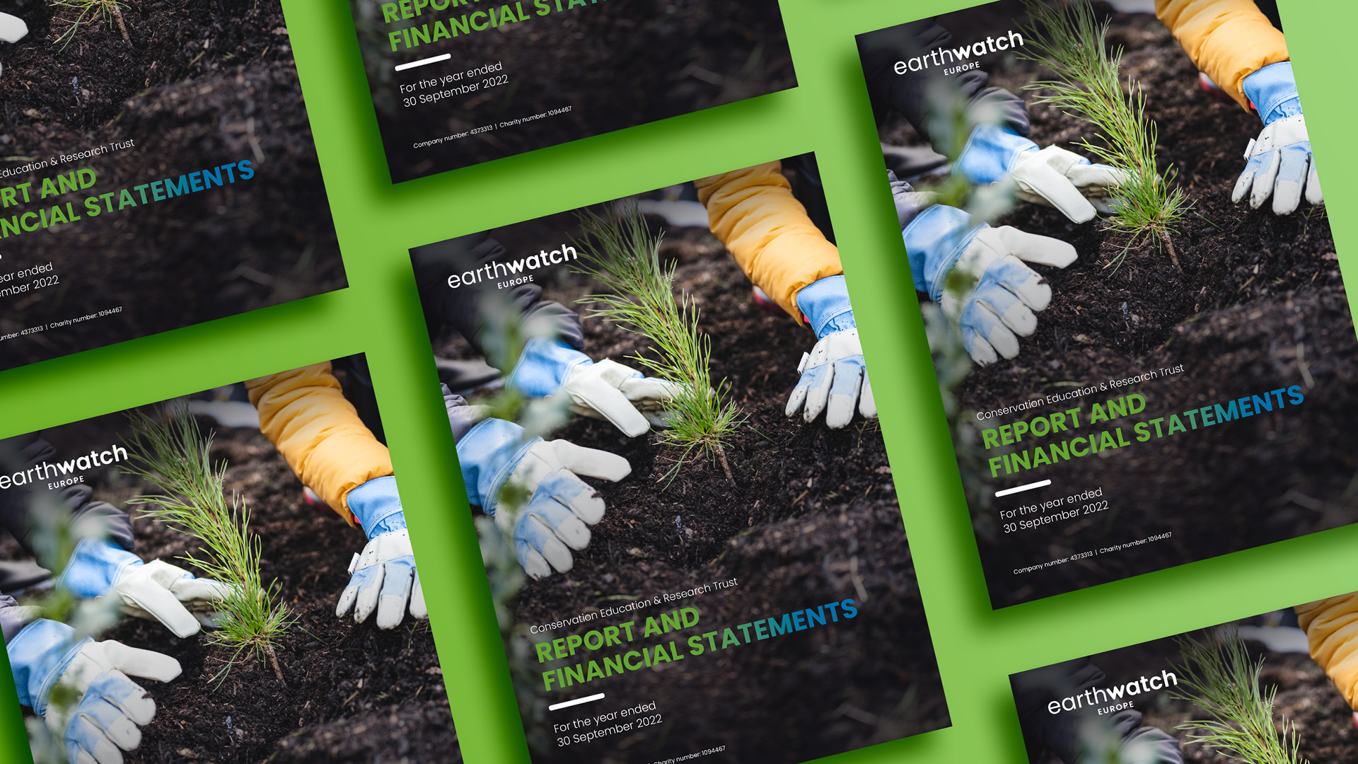
To create a visually engaging annual report that clearly communicates Earthwatch’s values and impact to a wide range of stakeholders. To tailor the design for delivery purely via digital platforms and to push the boundaries whilst staying true to the existing brand. To create a document that supports their aim of creating meaningful connections as a solution to environmental and social challenges.

What we delivered

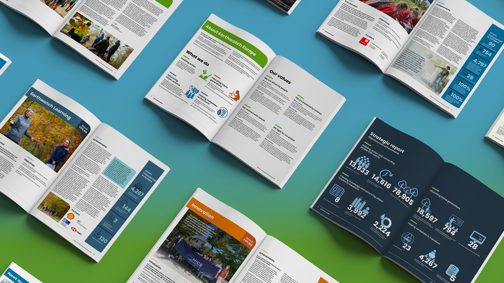
  • We changed the A4 format to US letter size to make the pages a little wider and shorter, and a better fit for viewing on screen.
  • Images were deployed in full bleed and with greater emphasis to promote Earthwatch’s people/environmental values.
  • A key requirement was to highlight 5 projects and include a ‘financial year in numbers’ for each. Designed to look like pull-down tabs and featuring infographic style icons, these graphics can easily be re-purposed for social media posts. By using a different colour from Earthwatch’s brand palette for each project, and locating the ‘tabs’ on the right-hand side of the page, they also serve to aid navigation. For variety, some tabs were presented vertically, others horizontally.
  • We introduced a more organic, softer look by rounding the corners of boxes, tables and icons, including headers and images where appropriate.
  • By presenting copy in a two/three column grid and using images to break up the text, we addressed the challenge of presenting a lot of copy for each spread, while still allowing the text to breath.
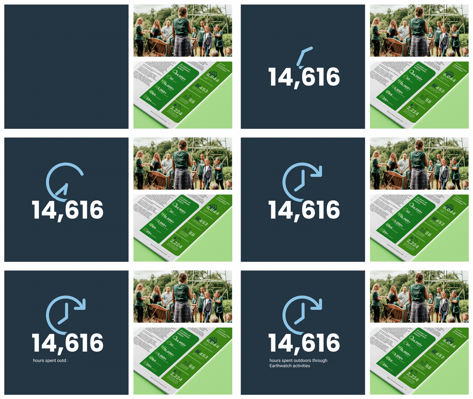
  • The brief specified a centre spread infographic which we designed in solid blue to stand out against the other white/light grey pages. The icons were designed with animation potential in mind, to enable more engaging delivery across digital platforms.

“This was our first project with The Graphic Design House and it couldn’t have been smoother. The team paid careful attention to our brief and feedback, was responsive and flexible, and showed hard work and creative flair. We’re really pleased with the end result, which showcases our work to supporters in a clear and visually compelling way.”

Amy Crosweller , Director of Fundraising & Communications